The React UI library for ChatGPT Apps SDK
Production-ready components, hooks, and design system to build beautiful ChatGPT Apps 10x faster. OpenAI Figma-aligned, fully typed, and accessible.


🎪 Live Storybook · ⚡ Quick Start · 🧪 Examples · 🧱 Components
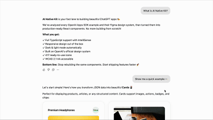
AI Native Kit UI bridges the gap between structured MCP JSON and beautiful, accessible UI for ChatGPT apps. Designed for the Apps SDK, it maps model/tool results directly to interactive, Figma‑aligned components, so you stop hand‑wiring UI and start shipping.
- ✨ What you get: Production‑ready React components, example patterns, hooks for Apps SDK, and a rich design‑token system.
- 🧭 Who it's for: Developers building ChatGPT Apps who want consistent, on‑brand UI without reinventing the wheel.
Why now? ChatGPT Apps (via the Apps SDK) expose results + UI metadata. This kit renders those results as native widgets with minimal code.
You should use AINativeKit if you're:
- ✅ Building ChatGPT Apps with the Apps SDK
- ✅ Converting MCP/tool JSON outputs into user interfaces
- ✅ Want production-ready components instead of building from scratch
- ✅ Need OpenAI Figma design consistency out-of-the-box
- ✅ Value TypeScript, accessibility, and developer experience
| Developer Pain Point | How AINativeKit UI Helps |
|---|---|
| Manually converting JSON to UI | Native JSON -> UI mapping components streamline integration |
| Lack of ChatGPT‑specific components | Built specifically for the ChatGPT Apps SDK with optimized patterns |
| Inconsistent design & icons | Figma‑aligned tokens + typed icon library ensure visual consistency |
| Accessibility concerns | WCAG 2.1 AA mindful components with ARIA support |
| Poor developer experience | 100% TypeScript, IntelliSense, Storybook docs |
| What You'd Usually Do | With AINativeKit |
|---|---|
| ❌ Hand-wire 50+ lines of JSX per card | ✅ <SummaryCard {...data} /> |
| ❌ Search for Figma design specs | ✅ Figma-aligned tokens included |
| ❌ Build icons from scratch | ✅ 417 OpenAI typed icons ready |
| ❌ Set up dark mode manually | ✅ Automatic theme detection |
| ❌ Write custom hooks for SDK | ✅ useOpenAiGlobal() hooks included |
| ❌ Test accessibility yourself | ✅ WCAG 2.1 AA tested |
Bottom line: Ship features, not infrastructure.
- 🎯 Apps SDK Optimized: Components designed to work seamlessly with ChatGPT Apps SDK
- 🔄 JSON -> UI Mapping: Render structured MCP results with minimal glue code
- 🤖 AI-Tool Friendly: JSON schemas, component registry, and utilities for AI code generation
- 🎨 417 Figma‑Aligned Icons: Fully typed and tree‑shakeable
- ♿ Accessibility First: ARIA attributes & sensible focus management
- 🌗 Dark/Light Themes: Built‑in theme switching
- 🧩 Production‑Ready Blocks: Cards, lists, carousel, album, map, and more
- 🪝 OpenAI Hooks:
useOpenAiGlobal,useWidgetState,useMaxHeight - 📦 Tree‑Shakeable & Type‑Safe: Import only what you need
npm install @ainativekit/ui
# or
pnpm add @ainativekit/ui
# or
yarn add @ainativekit/uiimport { SummaryCard } from '@ainativekit/ui';
import '@ainativekit/ui/styles';
// Example MCP/tool JSON from your backend
const restaurantData = {
title: "Little Nona's",
subtitle: '1427 Via Campania',
rating: '9.2',
description:
'A tiny, brick-walled trattoria tucked down a side street. The windows glow warm gold at night.',
images: [
// Display up to 4 images
{ src: 'https://images.unsplash.com/photo-1513104890138-7c749659a591?w=400', alt: 'Pizza' },
{ src: 'https://images.unsplash.com/photo-1621996346565-e3dbc646d9a9?w=400', alt: 'Pasta' },
{ src: 'https://images.unsplash.com/photo-1512621776951-a57141f2eefd?w=400', alt: 'Salad' },
],
};
export function RestaurantListing() {
return (
<SummaryCard
images={restaurantData.images}
title={restaurantData.title}
subtitle={restaurantData.subtitle}
badge={restaurantData.rating}
badgeVariant="success"
description={restaurantData.description}
buttonText="Add to Order"
onButtonClick={() => navigate(`/restaurant/${restaurantData.id}`)}
/>
);
}import { Card, Features } from '@ainativekit/ui';
import '@ainativekit/ui/styles';
export function DocumentCard() {
return (
<Card elevationLevel={1} interactive>
<Card.Header>
<Card.ChipGroup>
<Card.Chip variant="neutral" size="sm">
AINativeKit UI
</Card.Chip>
<Card.Chip variant="neutral" size="sm">
Guide
</Card.Chip>
</Card.ChipGroup>
</Card.Header>
<Card.Image
src="https://images.unsplash.com/photo-1499750310107-5fef28a66643?w=400&h=200&fit=crop"
alt="AINativeKit UI library documentation"
/>
<Card.Body>
<Card.Title as="h3">Building AI-Native UIs</Card.Title>
<Card.Description>
Build modern, accessible UI with AINativeKit. Master reusable component patterns that
scale.
</Card.Description>
<Card.Meta>
<Features
items={[
{ icon: 'clock', label: '10 min read' },
{ icon: 'calendar-today', label: 'October 30, 2025' },
]}
iconSize={12}
/>
</Card.Meta>
</Card.Body>
<Card.Footer>
<Card.Actions align="start">
<Card.ActionButton variant="primary">Explore Docs</Card.ActionButton>
</Card.Actions>
</Card.Footer>
</Card>
);
}📚 Explore many more examples in Storybook -> https://www.ainativekit.com
- Cards: Image, summary, list, discovery
- Lists: Structured lists with rich content
- Carousel: Horizontal scroll galleries
- Album: Media gallery with fullscreen
- Map: Location UI pattern with fullscreen
Tip: Copy any example from Storybook into your app and tweak the props.
Core: Button (primary/secondary/tertiary/ghost) · Icon · Badge · Chip · Alert · Skeleton · Card
Patterns: Card variants · Carousel · List · Album · Map
Use consistent colors, typography, spacing, and elevation derived from OpenAI's Figma system.
import { colors, typography, spacing, elevation } from '@ainativekit/ui';

const style = {
  backgroundColor: colors.light.background.primary,
  padding: spacing[16],
  fontSize: typography.body.fontSize,
  boxShadow: elevation[1].shadow,
};
Icons:
import { Icon } from '@ainativekit/ui';
import { SettingsCog, Terminal, Star } from '@ainativekit/ui/icons';

// Preferred: Named icon components
<SettingsCog size="md" />

// Alternative: Dynamic icon by name
<Icon name="settings-cog" size="lg" />Utilities to integrate with the ChatGPT Apps SDK runtime.
import {
  useOpenAiGlobal,
  useWidgetState,
  useMaxHeight,
  useTheme,
  useDisplayMode,
} from '@ainativekit/ui';

function MyChatGPTWidget() {
  // Get theme (read-only in ChatGPT, controllable with ThemeProvider)
  const { theme, isControlledByChatGPT } = useTheme();

  // Access other OpenAI global values (reactive)
  const displayMode = useDisplayMode(); // 'inline' | 'pip' | 'fullscreen' | null
  const maxHeight = useMaxHeight(); // number | null

  // Or access any global property directly
  const locale = useOpenAiGlobal('locale'); // string | null

  // Manage persistent widget state
  const [state, setState] = useWidgetState({ count: 0 });

  return (
    <div
      className={theme === 'dark' ? 'dark-mode' : 'light-mode'}
      style={{ maxHeight: maxHeight ?? 600 }}
    >
      {/* your widget */}
    </div>
  );
}
Available Hooks:
useTheme()- Get current theme and optionally control it (see ThemeProvider below)useDisplayMode()- Get current display mode (inline/pip/fullscreen)useMaxHeight()- Get maximum height constraint for layoutuseWidgetState(defaultState)- Persistent state across ChatGPT sessionsuseOpenAiGlobal(key)- Access anywindow.openaiproperty reactivelyuseWidgetProps(defaultProps)- Get tool output data
For development and standalone apps, use ThemeProvider to enable programmatic theme control:
import { ThemeProvider, useTheme } from '@ainativekit/ui';

function App() {
  return (
    <ThemeProvider defaultTheme="light">
      <MyApp />
    </ThemeProvider>
  );
}

function MyApp() {
  const { theme, setTheme, isControlledByChatGPT } = useTheme();

  return (
    <div>
      <p>Current theme: {theme}</p>
      <button
        onClick={() => setTheme?.(theme === 'light' ? 'dark' : 'light')}
        disabled={isControlledByChatGPT}
      >
        Toggle theme
      </button>
      {isControlledByChatGPT && <p>Theme is controlled by ChatGPT</p>}
    </div>
  );
}
Theme Behavior:
- Inside ChatGPT: Theme is read-only (
window.openai.theme),setThemehas no effect - Inside ThemeProvider: Theme is controllable, persists to localStorage
- Standalone: Theme defaults to system preference or specified default
ThemeProvider Props:
defaultTheme- Initial theme ('light' or 'dark'), default: 'light'storageKey- LocalStorage key for persistence, default: 'ainativekit-theme'enableSystemTheme- Detect system preference, default: true
AINativeKit UI exports comprehensive TypeScript definitions for the ChatGPT Apps SDK, giving you full autocomplete and type safety for window.openai.
// Simply import the package
import '@ainativekit/ui';

// window.openai is now fully typed! ✨
const theme = window.openai?.theme; // 'light' | 'dark' | undefined
const toolOutput = window.openai?.toolOutput; // string | undefined
const displayMode = window.openai?.displayMode; // 'inline' | 'pip' | 'fullscreen' | undefined

// Full autocomplete for all methods
window.openai?.sendFollowUpMessage({ prompt: 'Show more' });
const result = await window.openai?.callTool('get_weather', { location: 'SF' });All ChatGPT Apps SDK types are exported:
import type {
  OpenAiGlobals,
  OpenAiApi,
  Theme,
  DisplayMode,
  UserAgent,
  SafeArea,
} from '@ainativekit/ui';

// Use in your own type definitions
type MyWidgetProps = {
  theme: Theme;
  displayMode: DisplayMode;
};
Exported Types:
OpenAiGlobals- Completewindow.openaiglobals interfaceOpenAiApi- API methods (callTool,sendFollowUpMessage, etc.)Theme-'light' | 'dark'DisplayMode-'inline' | 'pip' | 'fullscreen'UserAgent- Device type and capabilitiesSafeArea- Safe area insets for mobile layoutsCallTool- Type-safe tool calling signature- And more... (see types.ts)
AINativeKit UI is optimized for AI coding assistants through Context7 and runtime utilities.
If you use Claude Code, Cursor, or other AI editors with Context7 support:
use context7 @ainativekit/ui
This will inject the latest component documentation directly into your AI's context, enabling:
- Smart component suggestions
- Accurate prop recommendations
- Best practice guidance
- Code generation with examples
Dynamically render components from JSON/API data in your production app:
import { renderComponent, type ComponentConfig } from '@ainativekit/ui';

const config: ComponentConfig = {
  type: 'SummaryCard',
  props: {
    title: "Little Nona's",
    badge: '9.2',
    images: ['https://example.com/restaurant.jpg'],
    buttonText: 'Add to Order',
  },
};

const card = renderComponent(config); // Renders <SummaryCard {...props} />
Runtime Utilities:
- 🔧
renderComponent()- Render from JSON config - ✅
validateComponentConfig()- Validate component configs - 📝
ComponentPropsMap- Type-safe prop definitions
AI Integration:
- 🤖 Context7: Documentation via "use context7" command
- 📚 Schemas: Can be generated with
pnpm --filter @ainativekit/ui generate:schemasfor external tooling (not used in runtime) - 📖 Guide: See
/docsfolder for comprehensive documentation
pnpm install          # install deps
pnpm storybook        # run interactive docs
pnpm test             # run tests
pnpm build            # build the library
pnpm lint             # lint
Package structure
@ainativekit/ui
├── /               # Components, tokens, hooks, utilities
├── /icons          # 417 icons as named React components
├── /tokens         # Design tokens only
└── /styles         # CSS styles

Repository (for documentation & tooling):
├── /docs           # Markdown documentation (Context7)
├── /schemas        # JSON schemas (generated on-demand, not committed)
└── /metadata       # Component registry (dev tooling)
- React ≥ 18
- TypeScript ≥ 5 (recommended)
- ChatGPT Apps SDK (preview)
- Works with modern bundlers (Vite, Next.js, etc.)
- More first‑class MCP JSON -> UI mappers (tables, charts, forms)
- Expanded widget patterns used commonly in ChatGPT apps
- Theming API refinement + tokens export
- Additional a11y audits
Have ideas? Please open an issue or PR!
If AINativeKit saves you time:
- ⭐ Star this repo - Helps other ChatGPT Apps developers discover us
- 🐦 Share on Twitter/X - Spread the word about building ChatGPT Apps faster
- 💬 Join discussions - Share what you're building in GitHub Discussions
- 🤝 Contribute - See
CONTRIBUTING.mdfor guidelines
Every star helps us grow the ChatGPT Apps SDK ecosystem!
- Storybook: https://www.ainativekit.com
- NPM: https://www.npmjs.com/package/@ainativekit/ui
- GitHub: https://github.com/AINativeKit/chatgpt-apps-sdk-ui
- Issues: https://github.com/AINativeKit/chatgpt-apps-sdk-ui/issues
Built for the OpenAI Apps SDK community. Inspired by ChatGPT App examples, OpenAI Figma design, Apple HIG, Material UI, Chakra UI, and Ant Design.
Made with ❤️ by and for ChatGPT App developers.
Stop wiring UIs manually, start shipping faster with AINativeKit.